1. A single philosophy: user centric

At Umbraco, you feel at home. From the configuration to the input of new content, its user-friendly design leaves nothing to chance. This is a pleasant and clever tool… that really likes you!
1.1 All set on intuitiveness

If there is one CMS that deserves to be called ‘friendly’, this is the one. The User is at the heart of its design.
Since its creation in 2004, Umbraco CMS has always kept the user at the core of its concerns. Niels Hartvig, the brilliant Danish developer at the origin of the project, immediately coined it "The Friendly CMS".
Today, Umbraco has lost nothing of this extraordinary simplicity. Yet, it has become one of the most exhaustive tools available on Microsoft platform to update, websites, mobile and multimedia applications.
Put it to the test, place any user in front of Umbraco’s interface, and ask them to create a new page of content. Just like that, with no further explanations. They will be surprised to succeed very quickly, nearly effortlessly.
Yes, with Umbraco, no more obscure contribution interfaces featuring a ton of buttons. The contributor is at home, working comfortably within the "Contents" section. No risk of getting confused by the parameter settings which access is reserved to the developers.
From there, publishing is child’s play. Icons, pull down menus, input fields, WYSIWYG, confirmation buttons: everything is displayed in a logical, predictable, meaningful manner. A true model of affordance, the ability that some interfaces have to be self-sufficient.
The other Umbraco sections, intended for webmasters or developers, are just as easy to use.
Three well defined sections
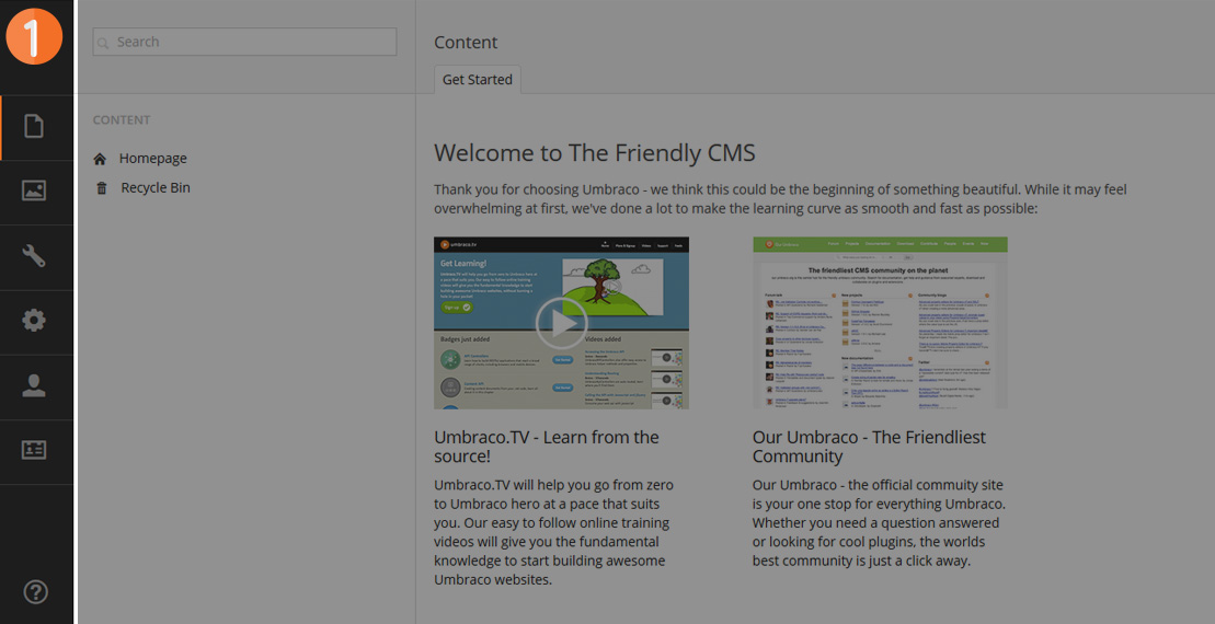
1. MenuQuick access to the main pages (contents, medias, parameters, tools for developers, users, members).
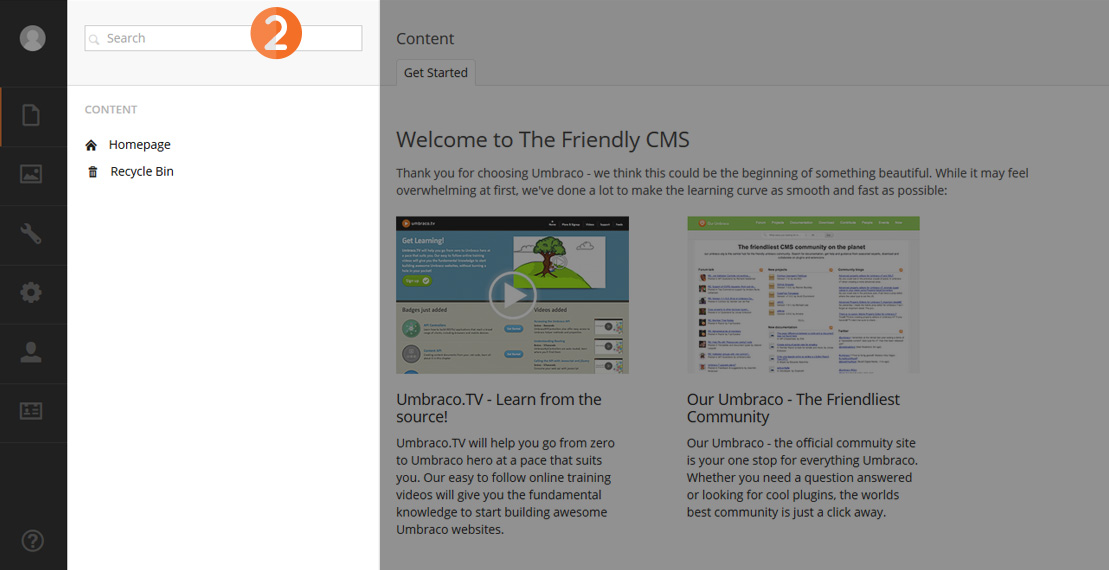
2. Tree structureWhen clicking on an element of the Menu, the corresponding tree-view is loaded here.
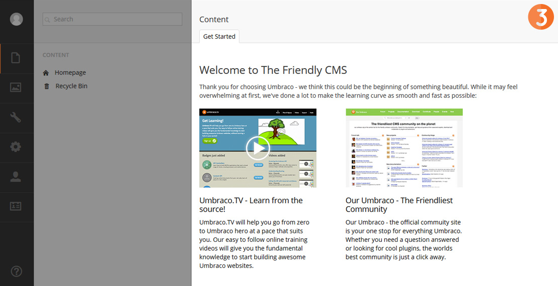
3. Publishing When clicking on an element of the tree-view, Umbraco loads the corresponding publishing form here. This page can also feature various control panels: latest documents published, user help, list of packages...
Divided into three separate areas the interface instantly offers a clear view of the CMS, from the overall aspects to the details.
1.2 Directories and sub-directories: sounds logical, no?
First shock: the content tree-view. Everything is crystal clear at the first glance! It is the most logical and predictable display to offer the users. It really is as simple for them as browsing with Windows Explorer or Apple Finder.
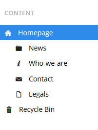
With Umbraco, the tree-view can reflect the structure of the pages on the site, or display a more specific contents structure, depending on the project requirements.
And this really changes everything. Whether you have 10 or 1000 items to manage, you can easily find your way around, everything neatly ordered, and the hierarchy is displayed in full. This is an asset that is cruelly lacking in Drupal or WordPress.
You can fine tune users access rights, and prevent contributors from creating unwanted material anywhere they want. For example: news items will only be created in the "news" folder.
This hierarchical approach is a strong point for the consistency of the solution and contributes to its user-friendliness. As a result, with Umbraco, everything is structured according to this principle: contents, medias, parameters, users…
1.3 An interface that adapts to the contents
At heart of content publishing, users are the kings. Thanks to Umbraco’s advanced content typing features, it is easy to configure an interface tailored to each specific case, via a set of really well designed forms.
First, it is possible to define any type of content. This could be a type of page (column, article, blog note…) or part of a page (section, chapter…) Or even an entity with its own status (subsidiary, product in a catalogue, definition in a glossary…)
It is also possible to specify a type of object based on the properties of another, via inheritance (a car defined from the specifications of a typical vehicle). The more you delve into the details the more users are able to work on concrete notions that are relevant to them.
Then, within each type of content, it is possible to make things easier for users or make publishing more intuitive by defining the exact manner in which they publish data: automatic cropping of images, single choice value lists, pre calibrated text fields…
Umbraco provides dozens of types of fields ready to use. Including a WYSIWYG tool, that lets the contributors format text just like in Word. The buttons of this editor can also be entirely configured and can be added or deleted in a few simple clicks.

Example 1

Example 2
Result: when contributors accesses a page to edit content, the form is perfectly clear and adapted. The necessary fields (and only those) are structured in the tabs, together with a title and a description.
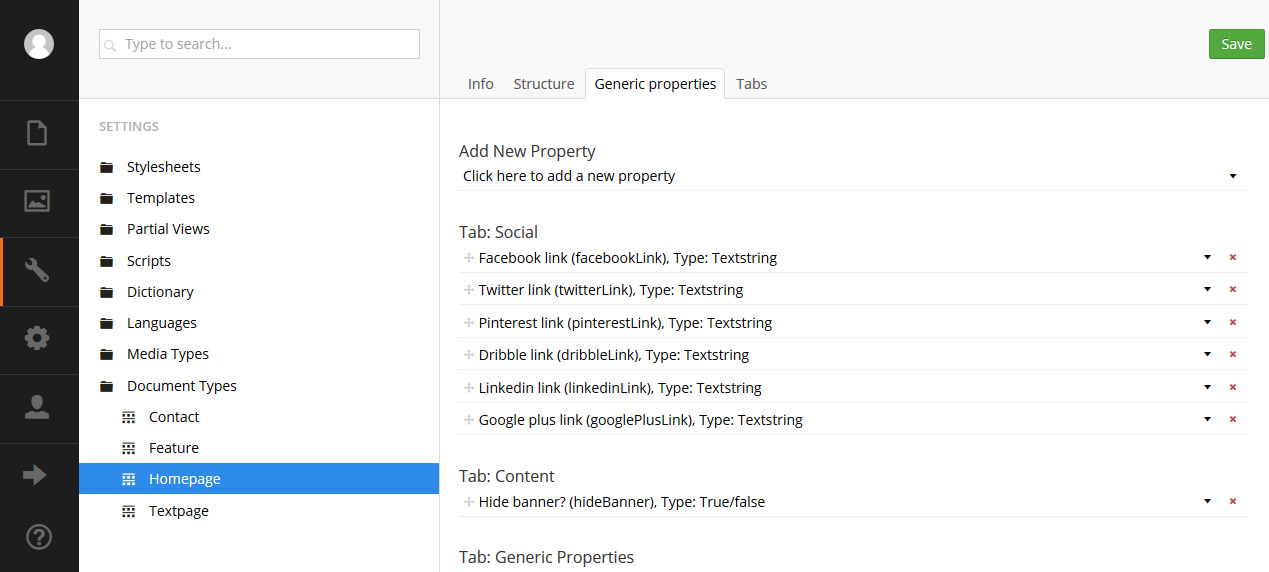
Configuration page for a document type
1.4 Publishing while you’re on the train: bet you can?
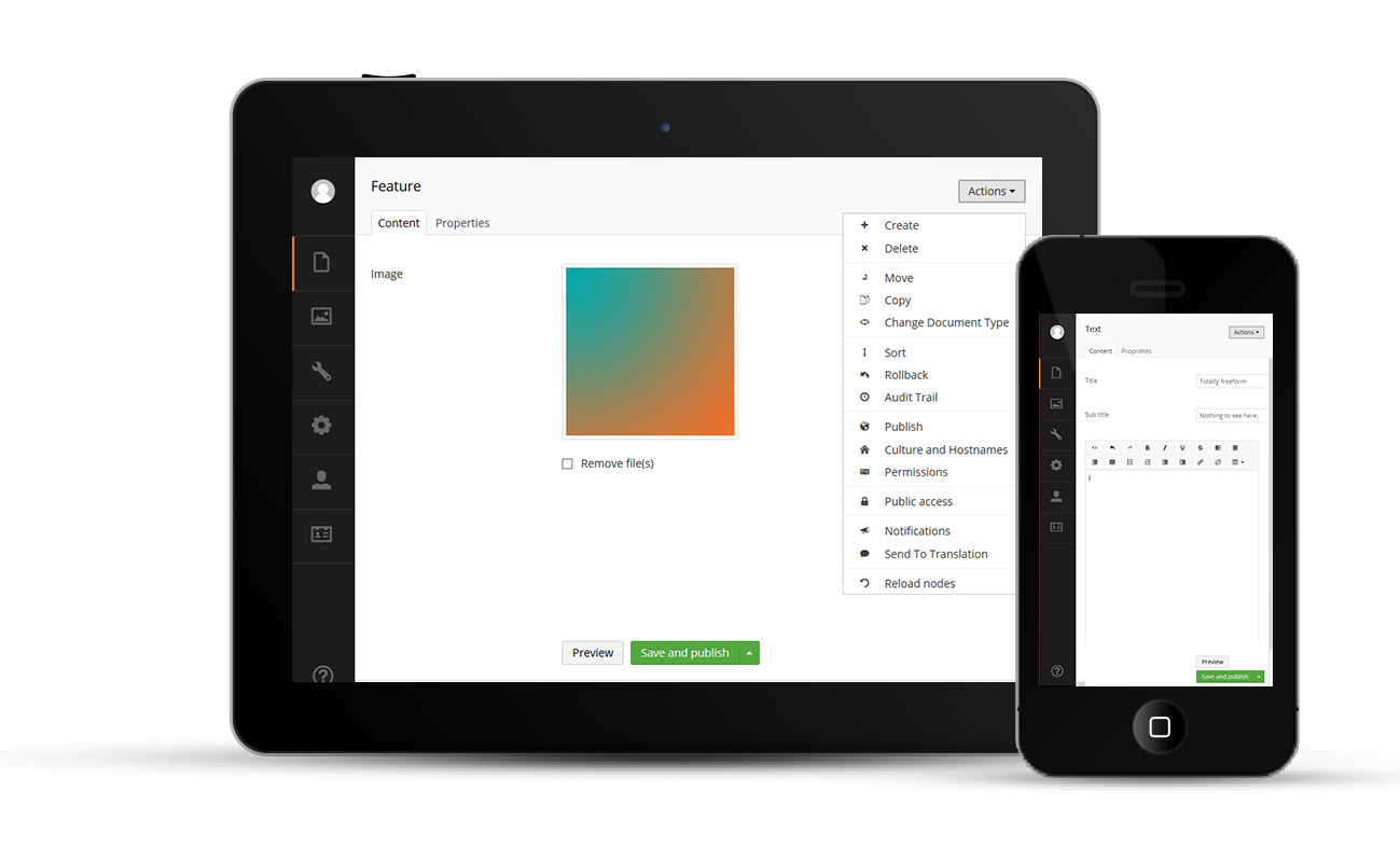
On the occasion of the launch of version 7, called "Belle", Umbraco’s interface has been entirely redesigned so as to be compatible with tablet and smartphone formats.
It has also been optimised for touch browsing. Even when on the move, the CMS is complete and easy to use. Have you ever tried to publish a home page when on a train?
Semmeo ranking: The interface ergonomics
Its intuitive ergonomics is one of the main assets of Umbraco. Even on tablets and smartphones!
- WordPress, initially a blog platform, is easy to master.
- Drupal and Jahia are founded on more complex interfaces and specific concepts that the contributors need to master: areas, taxonomies, paths, views, regions, blocks, etc.
Key benefits
For developers
Umbraco is with you all the way. From configuration using well designed forms, through to mobility thanks to its native compatibility with mobile devices.
For users
Your work tool boasts a really user-friendly interface, perfectly suited to your needs, and easy to understand. Even when accessing from your tablet or smartphone.

